Graphic Novel Work in Process

Graphic Novel page in process

I’ve been super busy the last few weeks working on a picture book. Yesterday, I finally completed the  artwork for it. So, while I’m waiting for comments from the publisher, I have a little time to work on the graphic novel pitch I’m developing.

Here’s the page I inked last night. I drew the panel borders and typed the dialogue in Adobe Illustrator. Then I printed it onto 11×17 Bristol paper. I penciled everything in blue pencil which I can easily remove in Photoshop later (The dialogue was also blue. This makes it easier if I have to re-write any dialogue later.) I drew the final ink lines primarily with my trusty Rapidograph pens.

So what do you think?

And I should be back on Friday with another page in the adventures of Jim and Ted, for both of  you who missed it the last few weeks.

Anabelly the Smelly Squid

Earlier in the year, I had the pleasure of illustrating the picture book “Anabelly the Smelly Squid” by first-time author Meghan Carlile. It’s a cute anti-bullying story set in an underwater school.

Anabelly Page

Since a large part of the story took place in the classroom, I had to make sure the room was consistent throughout the story. I briefly considered building and photographing a model classroom like I did for Bye, Bye Boogeyman. But I wanted to add shells and little coral reef-inspired details to the classroom and I knew it would be nearly impossible to keep those straight in multiple angles. So I decided to place the characters into the same classroom background– similar to the way they do it in animation. I have deliberately avoided doing this in the past because I didn’t want the book to look like it was simply cut and paste or that I was taking shortcuts.

I drew the classroom wider than a double-page spread so that I’d have the freedom to move it around and be able to crop it differently on every page.

Anabelly_ClassRoom

And then I added the characters into the scene. Notice that I made sure to redraw all the characters for every page–even with the re-used background set, I didn’t want any page to look too similar. (The blank area over the window in this image and the chalkboard in another one are where the text was placed.)

Anabelly04-05

Anabelly08-09

Anabelly10-11

And, just in case you still think I was cutting corners on this book, here is another double-page spread from a different section.

Anabelly Page

This book was also my first time working with the publisher Zebra Ginko, who is relatively new to the publishing world. They had one of their own designers handle the text placement and book design aspects of this project– which is usually I task that I insist on doing myself. And there are a few things that I would have done differently had I done it myself, but they did a pretty good job with it overall.

If you’re interested in the book, you can find it on Amazon:

Making of The Mad Monster Museum

Last week, I talked a little about my new Halloween book with author Donna Davies, Halloween Night at the Mad Monster Museum.

Now, I’d like to take you behind the scenes of the creation of the big masquerade ball image from the book.

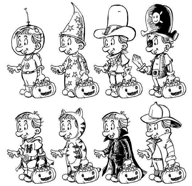
I knew that with all ten characters plus assorted background figures, this double page spread would be the most challenging and time consuming part of the book. So, even though it’s towards the end of the story, I began work on it first.

I started out with a few small thumbnail sketches to work out placement of things. I settled on this one, which seemed to do have room for everything I needed.

Thumbnail

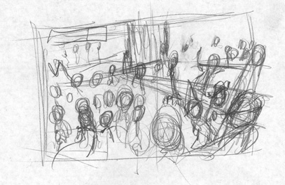
I scanned the thumbnail, enlarged it to print size, and placed the text it in’s approximate position. It still seemed like a good composition, so I turned the sketch to blue in Photoshop and printed it out at full size. And I drew a better sketch atop the original sketch. The blue lines made it easier for me to distinguish between the two as I drew. I worked around the page, making sure that the major characters were all given the right spotlight and that the reader’s eye would be drawn properly around the page.

RoughPencils

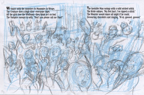
When I was happy with the sketch, I scanned it into Photoshop. I have a simple Photoshop action that pulled out the blue lines, leaving the pencil sketch behind. A little touch ups here and there, and it was time to show the sketch to Donna.

Pencils

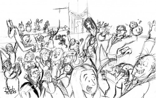
In this case, Donna was happy with the sketch and didn’t request any changes. That’s a huge advantage of working with a the same author on multiple projects– you develop a trust in the working relationship that makes things easier. I probably wouldn’t have been able to get away with such a loose sketch (especially in the background characters) with some of my past clients.

So with the sketch approved, I recolored the lines blue (as I did earlier), and printed onto 11×17 Bristol paper to ink the final art. For this project, I primarily inked with my trusty Rapidograph technical pens.

RoughInks

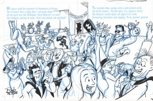
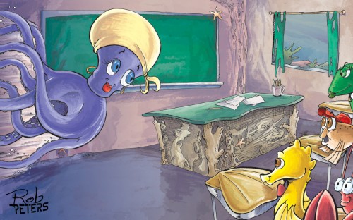
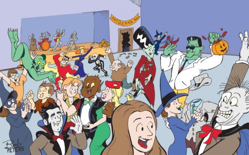
The completed inks were then scanned and the blue lines removed in Photoshop. After a few touch ups, the result looked like this:

Inks

Then it was time for the one part of this process that I find a little tedious, laying in the flat colors. With this many figures, it took me a day or so to flat everything. At this stage, I make sure that the colors help the eye move through the piece. Color can direct the eye and change the focal point, so it’s vital to keep things both balanced and moving (I hope that makes sense.)

FlatColor

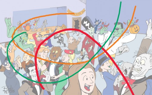
Let’s see if I can explain that better. Here is a graphic showing the 3 major colors in this piece: orange, red, and green. Orange and green each form a similar arc that guides the eye through the piece. The darker reds create an inverse arc to give a counter balance to everything. I don’t always have the time to put this much thought and planning into a piece, but it makes a drastic difference when I can.

ColorMotion

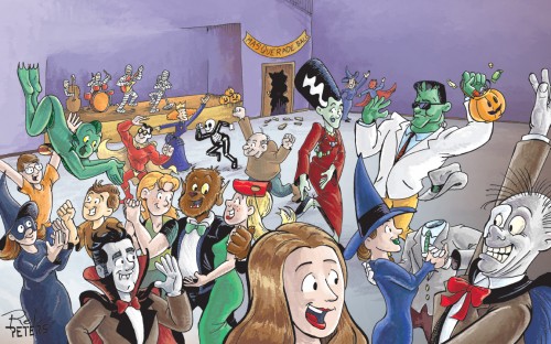
And then the really fun part, laying in the tone and shadows. With so many characters, it’s easy for me to get lost in the details and lose the implied motion I so deliberately created in the flat color stage. I’ve done that more than once and wound up with a non-descript grey blob of an image, which no one wants in their children’s book. So it’s important for me as I paint (and even though it’s all Photoshop at this point, it’s still painting) to keep pulling back and zooming out to view the whole image and not just the parts.  You’ll notice there are a few places that I changed the colors on from the flat color (like the vampire’s inner cape changed from blue to red) to further reinforce the color balance I was trying for.

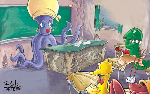
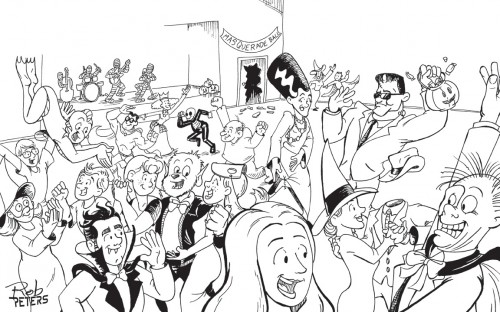
And so here’s the final page:

Monster Museum Page

And that’s how I create a page (or in this case, a double page spread) for a picture book.

You can see this spread in all it’s glory in the book Halloween Night at the Mad Monster Museum, which includes this brand new story and the 4 Halloween tales previously written by Donna Davies and illustrated  by me. You can buy the new book on Amazon.com. (If you hurry, you can probably still get it before the 31st!)

Bye, Bye Boogeyman Room

I’m pretty sure I promised this post back in October, but I’m just finally getting around to writing it. So thanks for waiting patiently for so long.

When I was illustrating the book Bye, Bye Boogeyman (written by the incomparable Donna Davies) I had a challenge in the little girl’s bedroom. In most of my books, I play fast and loose with the architecture. But this book takes place entirely in one room. So I had to keep the room dimensions and furniture locations consistent throughout.

And my first few sketches proved that was a bigger challenge than I expected.

So I called my mother and had her send me some of my sister’s old doll furniture. The bed she found was coincidentally the same style I had already planned to draw. Perfect. I set up this little scene with cardboard walls and a playing card for the rug.
And then I took nearly 50 photos of the room.

STP84278
STP84287
STP84299

I didn’t trace any of the photos exactly, but used them as guides to keep things looking right in the book.

And here’s a few of the finished pages.

Boogeyman_03_signed

Boogeymanp04-05

Boogeymanp11

To see the rest of the illustrations, check out the book on Amazon.

Trick or Treat!


Boy_Options

When I began work on the Halloween book Night of the Candy Creepers, one of the first things I did was draw a bunch of costumes for the main character to wear as he went trick-or-treating through the neighborhood. I showed my best ideas to the author, Donna Davies, and she chose the vampire costume for the book. Which was the right idea for a spooky book, but I would have love to draw the cowboy or pirate costume for a story. Maybe someday…