Last week I talked about designing the main character in my new book “We Believe in Dinosaurs:Practice” based on the song “Practice” by children’s band We Believe in Dinosaurs. Today I want to talk about how I created a page for the book.
For every project I do, I “reinvent the wheel” somewhat, adjusting my style and working method to fit the project. I felt like the prehistoric landscapes in this book required a softer and more restrained color scheme than I usually use. But I wasn’t quite sure how to proceed until I read an article on Drawn.ca about artist Ryan Andrew’s unique coloring methods. I would adapt the technique as I went, but this gave me a starting point.
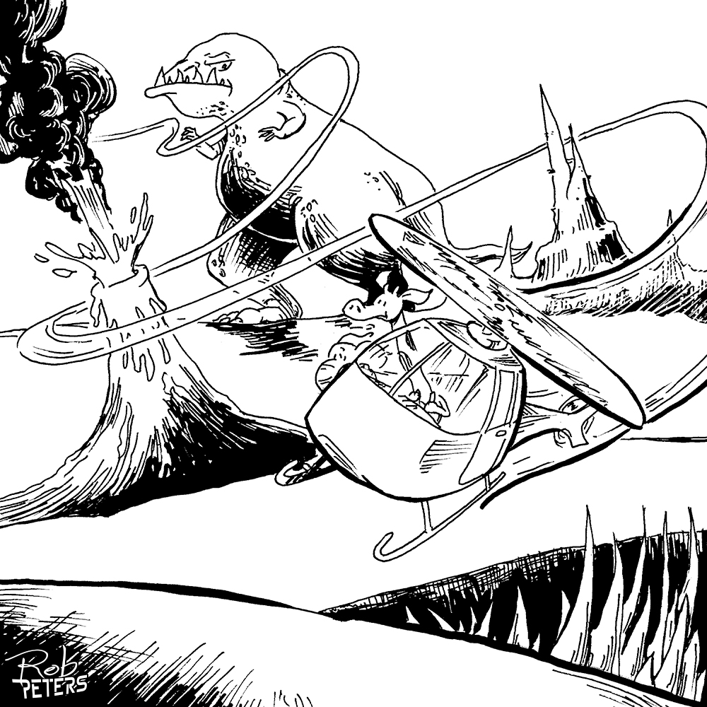
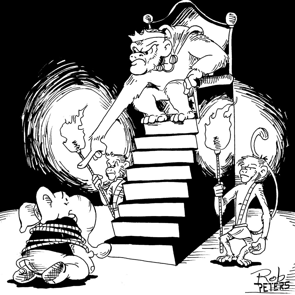
Let me show you how I worked one of the spreads from the book:
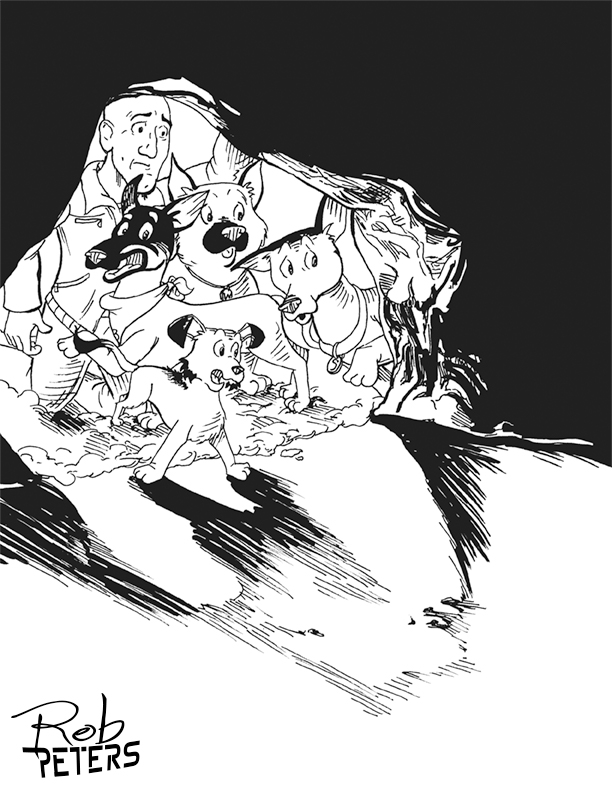
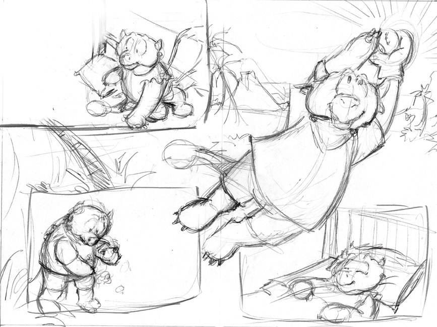
First I worked up this rough pencil sketch which I had my client approve. The book’s unique structure required comic book style inset panels which added an extra design challenge, but I came up with a solution that made everyone happy.
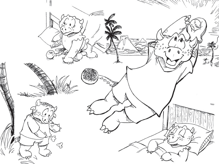
From there, I inked the image like I always do: on paper using a combination of my trusty Rapidograph pens and Pentel Brush pen. The inked artwork was scanned into Photoshop.
From here on, I began to deviate from my usual form. Following Ryan’s example, I colored everything in shades of gray. Major elements were done on different Photoshop layers to make selecting things easier later. By working in grayscale, I was able to make sure that there was proper contrast in the image before I got too deep in the coloring.
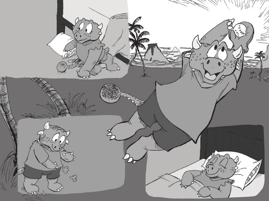
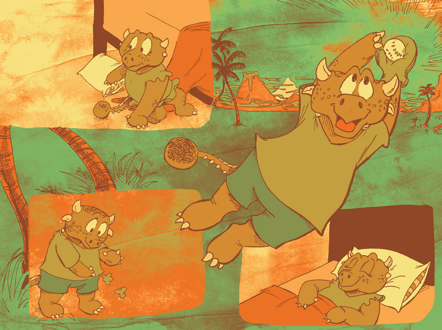
But that wasn’t quite enough for me. So I placed in a sloppy watercolor texture in the background. I have a couple dozen of these textures that I’ve made over the years. They help eliminate the harsh, overly perfect feel that my Photoshop work can get sometimes. I used various layer effects (overlay, multiply, screen) as needed so that the texture showed through in places. Then I converted everything to CMYK color mode (this caused a few of the grey shades to turn blue for some reason, but that didn’t matter at this stage).
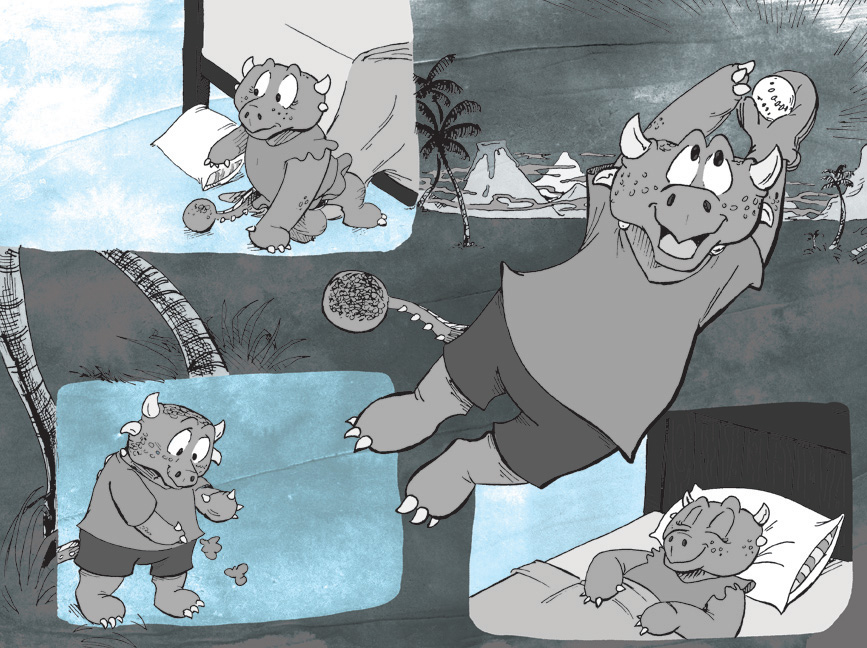
I had planned to use Ryan’s method of coloring but found three colors to be too restrictive for my tastes. Instead, I used Photoshop’s Gradient Map tool and applied a custom gradient over the whole thing.
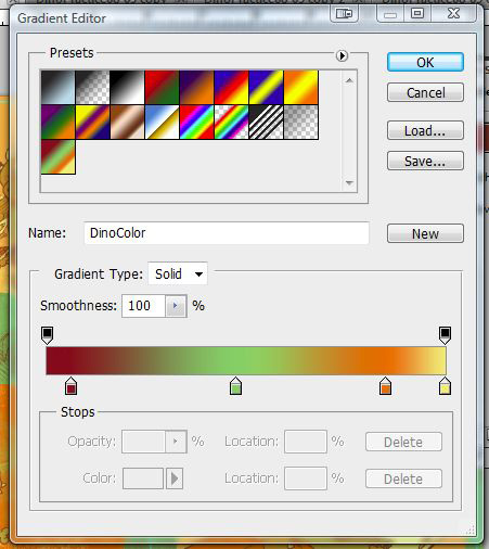
This turned my blacks into dark brown, mid-tones green, lighter tones into orange, and the whites became yellow.
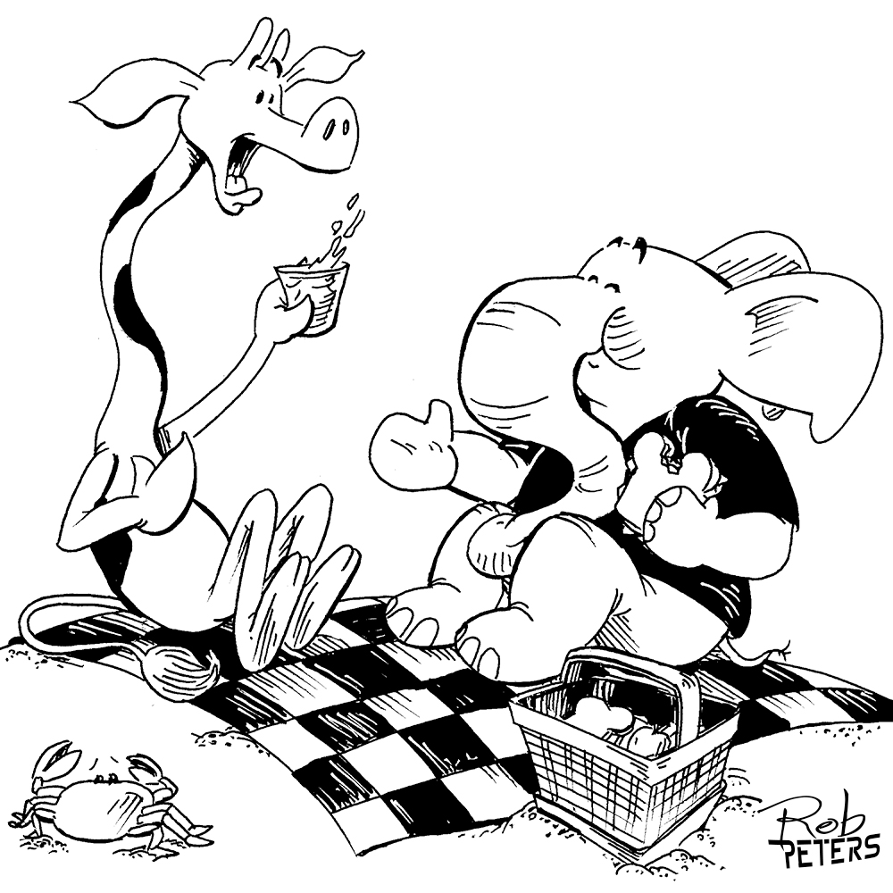
I was almost done. But now came the longest, but most fun part: painting in the tones. Using my trusty Wacom Cintique and stylus, I painted in shadows and highlights. And I wasn’t afraid to deviate from my color scheme in a few places. I added blue into the sky and colored the dinosaur kids’ clothing less drab colors. I also lightened color of the linework in the background to help it recede and on the kids’ freckles (or are they scales? I was never sure).
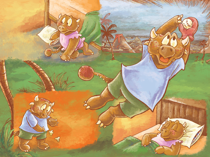
And so here is the final product! I’m really quite proud of it.
I’m not sure if I’ll use this technique again for another book, after a few pages it might have been easier to simply color things using the CMYK values I had already established previously. But I will definitely try it again on a smaller project.
The book is currently only available at the band’s website, which you can find here.